Orvane
Brand identity, packaging
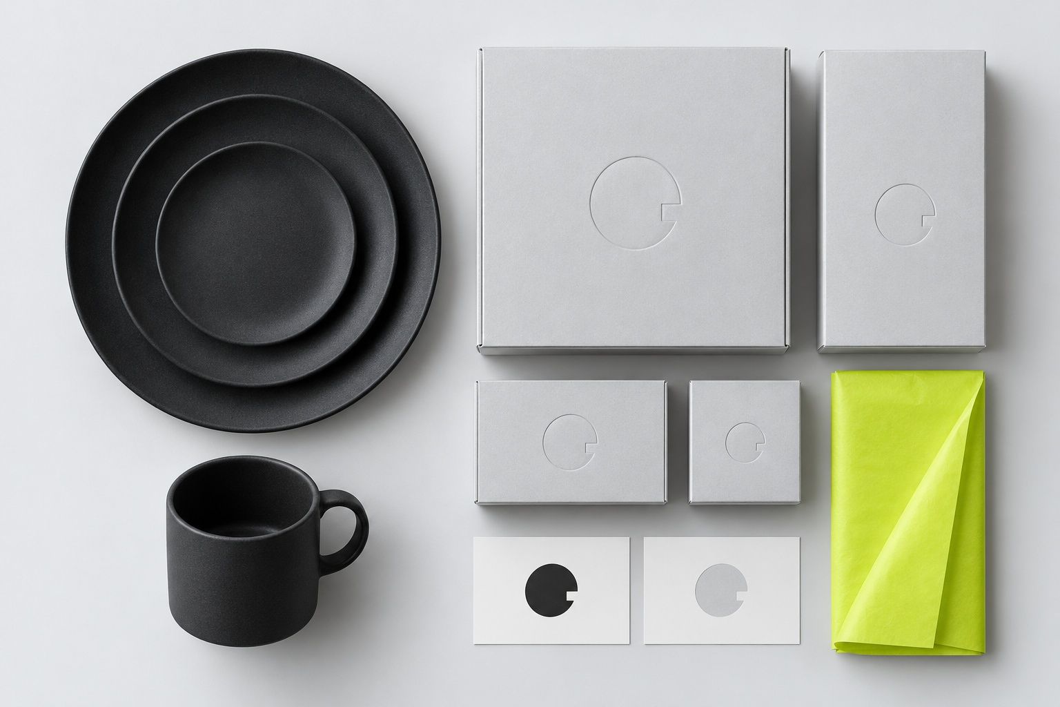
- Make handmade stoneware look as considered as the hotel tables it sells to.
- Identity, packaging system, art direction of the launch shoot
- 2026
- Wholesale orders up 38% in the first two quarters
Orvane is two potters and one kiln. Their work was already in four hotel restaurants, but the brand was a rubber stamp on brown paper, and buyers kept asking if they could take on a bigger order.
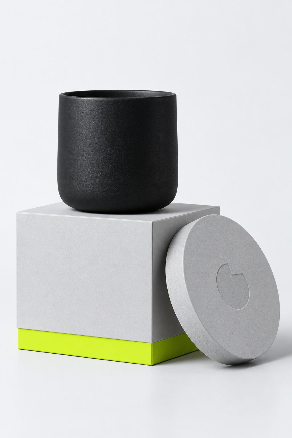
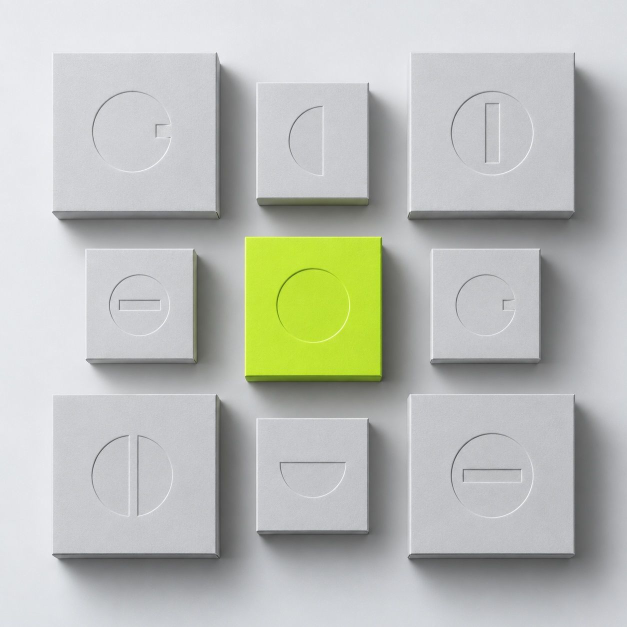
The mark is a circle with one notch cut out of it: the gap a potter leaves on the foot ring so steam can escape in the kiln. Everything else comes from that notch. The boxes carry it as a blind deboss, the tissue is the one bright thing, and the plates do the talking.
Process note
We spent the first week in the studio, not in software. Every packaging size was cut around a real plate, so a 26 cm dinner plate and a 9 cm cup ship in the same family of three boxes with no filler.